Interview with Architecture student Kristin Erlendsdottir
Embrace
Text: Matt Carey
Renderings of model: Kristin Erlendsdottir
Portrait photo: Johan Ronnestam
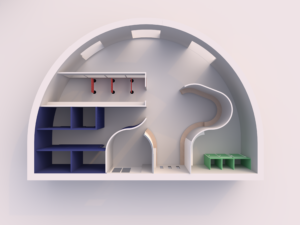
Embrace is a new approach to hospital design that focuses on social connections, healing, and wellbeing. The design explores the boundaries between private and public, using colour, form, light, and acoustics to create a space that is functional, playful and stimulating.
 Tell us briefly about the environment you’ve been working on?
Wellbeing for me is connected to colourful spaces, and organic shapes. I wanted the building to flow and be full of surprises. The space should embrace you. The concept is to play with the boundaries between public and private. In the public space there are big windows with doors leading outside. A large multi-use room can be adapted for social functions. Library rooms have windows that are only 1.5m heigh so while you’re sitting you still have a sense privacy. It’s a space where people can get used to the feeling of being around others and socialising. The private spaces are for visitors and private conversations.
Trying to explore the boundaries between private and public in an environment like a hospital. I also worked hard to get the curves in the space right, which helped the room to make sense. Curves give the space a sense of surprise, something unexpected, but at the same time I had to think about wheelchairs and furniture being placed against a curved wall. The curves make the room one natural transition but they are also positive for hygiene, as these areas are easier to clean. The curved exterior wall has also allowed me to maximise sunlight in the space during all hours of the day, which is great for wellbeing.
Private areas have blue wood wool tiles on every wall to max sound absorption and to create a sense of privacy. I’ve also used flexfelt dividers in the library and BAUX PULP. The patterning of PULP is wonderful and the material looks and feels so natural. It’s a great sustainable choice, which is important, as I wanted to make the space timeless.
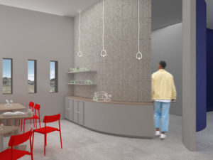
Curved walls have been used to help the space flow, creating a sense of surprise, openness and connection throughout the public areas. The curves add a playful element to the design whilst ensuring light flows throughout the space. Large windows let in natural light and provide views of the outdoor environment. The curved windows allow sunlight to filter into the building during all daylight hours of the day.
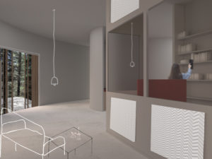
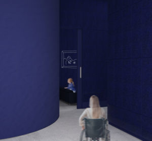
The use of colour denotes the boundaries between private and public spaces. Private family rooms have been clad in blue BAUX wood wool panels to provide a quiet and peaceful environment for patients and their families. BAUX Felt dividers in the library provide patients with private space for reading and relaxation. In the cafe, soft greys create a harmonious and timeless space, with pops of colour used to create a sense of energy and vitality. The use of Flexfelt floor dividers allows the space to be functional, comfortable and adaptable.
As acoustics were also an important aspect of the design, BAUX acoustic materials have been used throughout the space to create a calm and comfortable interior, free from background noise and distractions, so visitors and patients can enjoy privacy and social interaction on their path to better health.
Kristin Erlendsdottir is an interior architecture and furniture student from Iceland in her final year of studying towards a bachelor’s degree at Konstfack in Stockholm. She is interested in creating buildings that care for people and wants to create connections between buildings and nature.
Read BAUX’s previous blog post – Clerkenwell Design Week 2023. See images of the student’s models, the fair stand in collaboration with Morag Myerscough, and more.